
At a glance: Plan: Galleryberg Pro · Powered by Swiper · Works with the lightbox · Last checked: Galleryberg 1.2.1 (November 2026)
The Carousel layout in Galleryberg Pro turns a gallery into a touch-friendly image slider with arrows, dots, looping and optional autoplay. To use it, select the Galleryberg Gallery block, open the Settings panel, and set Gallery Layout to Carousel. A new Carousel Settings panel then lets you choose how many slides show on desktop, tablet and mobile.
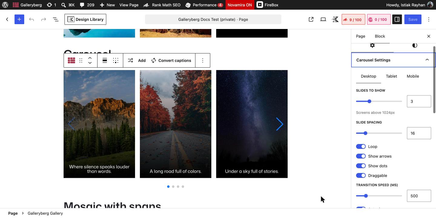
How to create a carousel gallery in WordPress #
- Add a Galleryberg Gallery block to a post or page and add your images with Upload or Media Library.
- Select the gallery by clicking the Galleryberg icon in the block toolbar.
- In the right sidebar, open Settings and set Gallery Layout to Carousel. Without an active Pro license, Carousel shows as “Carousel (Pro)” and cannot be selected.
- Open the Carousel Settings panel. Use the Desktop, Tablet and Mobile tabs to set Slides to Show for each screen size.
- Turn on Autoplay if you want the slides to move on their own, and set the Autoplay delay (ms).
- Optional: open the Styles tab and set Arrow Color, Dot Color (Active) and Dot Color (Inactive) under Color.
- Save or update the page, then view it on the front end to test swiping and the arrows.
Carousel settings explained #
| Setting | What it does | Default |
|---|---|---|
| Slides to Show (Desktop) | Number of images visible at once on screens wider than 1024px. | 3 |
| Slides to Show (Tablet) | Number of images visible on screens from 768px to 1024px. | 2 |
| Slides to Show (Mobile) | Number of images visible on screens narrower than 768px. | 1 |
| Slide Spacing | Gap between slides, in pixels. | 16 |
| Loop | After the last slide, the carousel continues from the first one. | On |
| Show arrows | Shows previous and next arrow buttons on the sides. | On |
| Show dots | Shows pagination dots below the carousel. | On |
| Draggable | Lets visitors drag or swipe slides with a mouse or finger. | On |
| Transition speed (ms) | How long the slide animation takes, in milliseconds. | 500 |
| Autoplay | Moves to the next slide automatically. | Off |
| Autoplay delay (ms) | Time each slide stays before moving on when Autoplay is on. | 3000 |
| Arrow Color (Styles tab) | Color of the arrow buttons. | Theme default |
| Dot Color (Active) and Dot Color (Inactive) (Styles tab) | Colors of the current dot and the other dots. | Theme default |
Good to know #
- The carousel works with the Galleryberg lightbox. Turn on Enable Lightbox in the Lightbox panel and visitors can click a slide to view it full screen.
- Captions, hover effects, rounded corners and shadows apply to carousel slides the same way they apply to other layouts.
- The Carousel is the only Galleryberg layout that loads extra JavaScript (Swiper). The other layouts are rendered on the server with CSS.
- You can switch from Carousel back to Tiles, Masonry or any other layout at any time without re-adding images.
Related docs #
- Mosaic Layout Guide (Pro)
- Tiles Layout Guide
- How to Use the Lightbox
- Galleryberg Core vs Pro feature comparison
Frequently asked questions #
Is the Galleryberg carousel included in the core plugin? #
No. The Carousel layout is a Galleryberg Pro feature, available on every Pro plan (Starter and Pro, yearly or lifetime). The core plugin from WordPress.org includes the Tiles, Masonry, Justified and Square layouts.
Can the Galleryberg carousel autoplay? #
Yes. Turn on Autoplay in the Carousel Settings panel and set Autoplay delay (ms) to control how long each slide stays. The default delay is 3000 milliseconds (3 seconds).
How do I show one image at a time on mobile? #
Open Carousel Settings, click the Mobile tab and set Slides to Show to 1. One slide on mobile is already the default. Tablet defaults to 2 and desktop to 3.
Does the carousel work on touch screens? #
Yes. With Draggable turned on (the default), visitors can swipe between slides on phones and tablets, and drag them with a mouse on desktop.
Can I open carousel images in a lightbox? #
Yes. Turn on Enable Lightbox in the Lightbox panel. Clicking a slide then opens it full screen with zoom, keyboard and swipe navigation.


