Responsive columns control lets you set different gallery column numbers for desktop, tablet, and mobile in WordPress. It helps images fit each screen properly. This control improves layout clarity, loading speed, and viewing comfort on all devices.
Below is a gallery created with the Galleryberg plugin. We’ll show you how to set a different set of columns for separate device types in the following tutorial.

Make Gallery Columns Responsive #
Select the entire gallery by clicking the Galleryberg icon on the toolbar. Go to the Settings tab on the right sidebar.
You’ll see the column section. By default, the desktop mode is selected. So, if you set the column number now, it will apply only to the desktop.
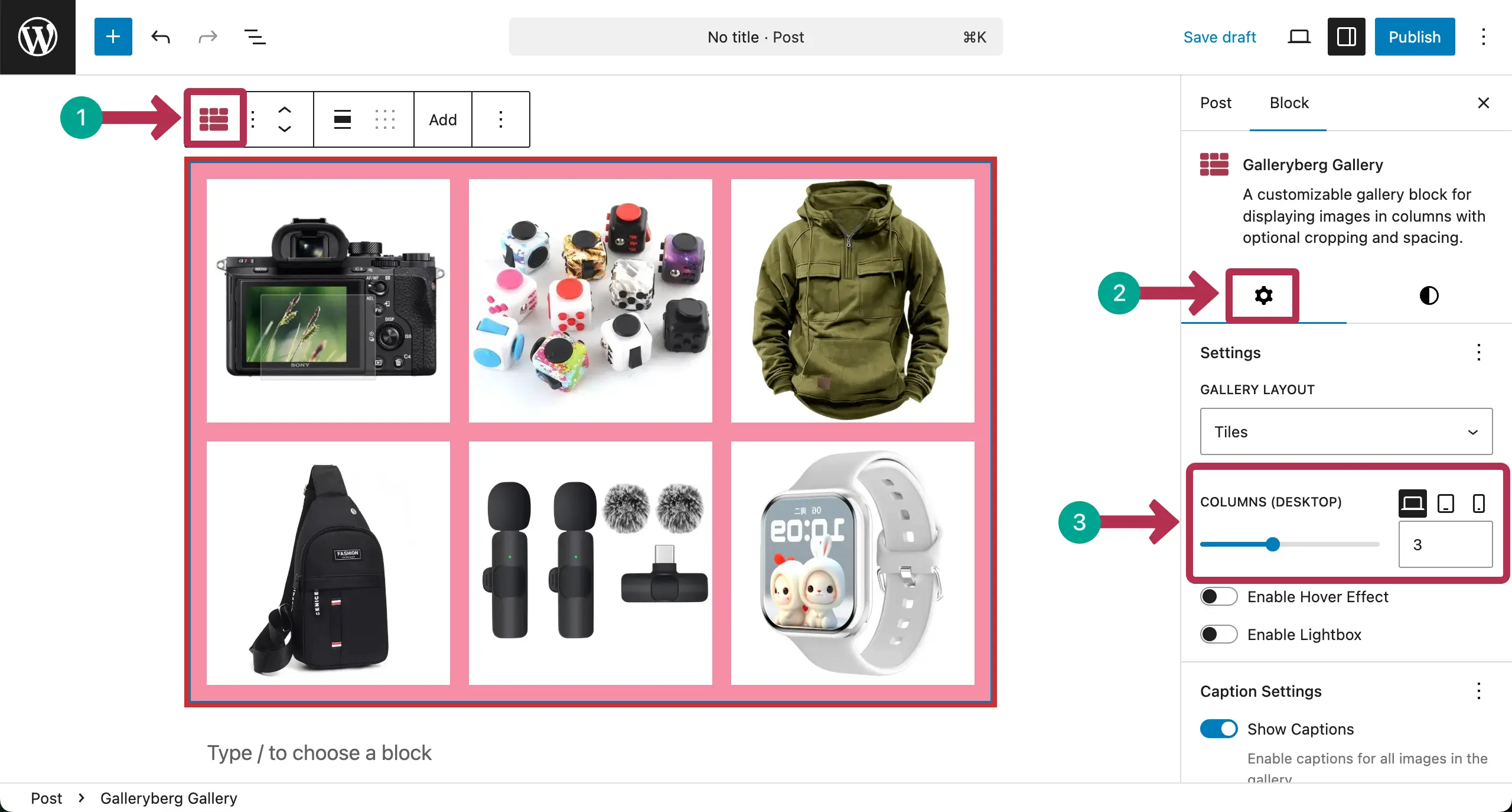
# Set Columns for Desktop
You can change the number of columns by moving the pointer or writing a numerical figure in the box.
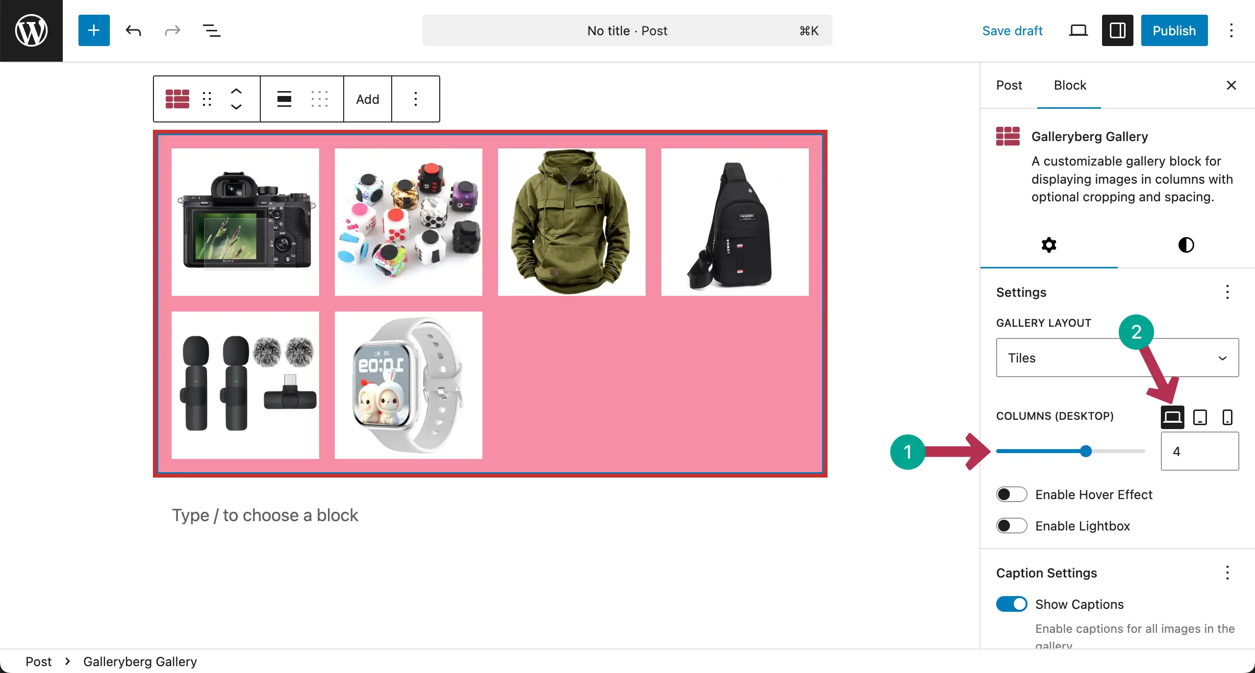
# Set Columns for Tablet
Switch to the tablet mode. In the same way, select the number of columns you want for the tablet screen size.

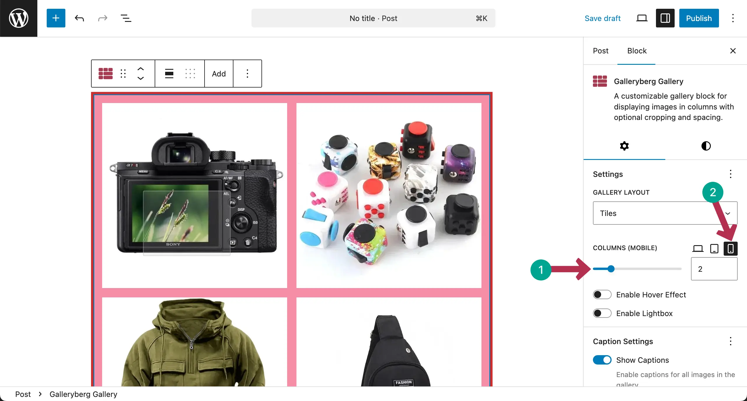
# Set Columns for Mobile Phone
In the same way, switch to the mobile mode. Specify the number of columns you want for the mobile screensize.
Note: No worries if you do not see different column numbers for different screen sizes inside the editor. It will display properly on your live website.
Conclusion #
To get the best from mobile responsiveness, use fewer columns on smaller screens for better visibility. Keep images large enough to view clearly. Test the gallery on mobile and tablet devices.
Avoid overcrowded layouts. Proper responsive column settings ensure a smooth and user-friendly gallery experience.


