
If you run a WordPress website, there may be times when you want to display two or more images side by side instead of stacking them one after another. This layout is useful for comparing images, showing before-and-after photos, or presenting related visuals together in a clean way.
The good news is that WordPress makes this easy. The default block editor includes built-in options that allow you to place images side by side without using any extra plugins or complicated setups.
In this guide, we will show you 4 easy ways to put images side by side in WordPress, using both built-in blocks and dedicated plugins like Galleryberg and Tableberg for more flexible layouts.
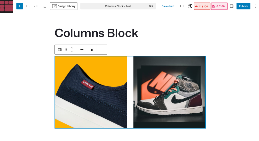
Method 1: Using the Columns Block
The Columns block is the simplest way to place images side by side in WordPress. It works best when you want to display two images next to each other without needing advanced layout options.
Step 1: Add the Columns Block
Open the post or page where you want to add your images. Click the plus (+) icon in the editor, search for Columns, and insert the block.
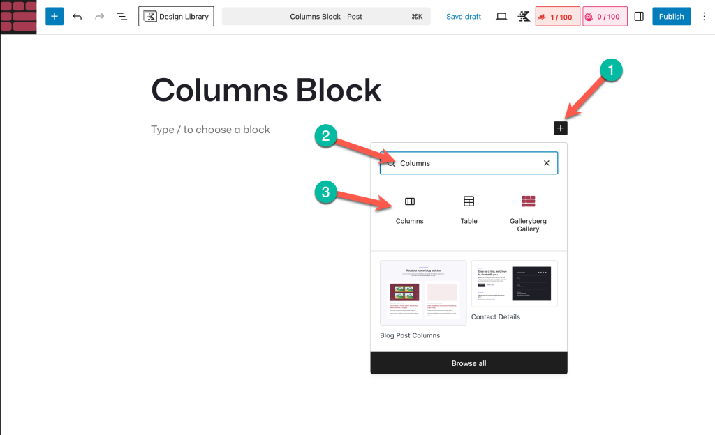
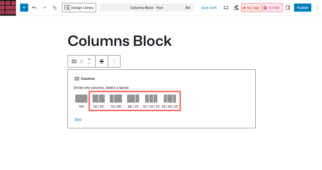
Choose a column layout based on how many images you want to show. For example, select two columns for two images side by side.
Step 2: Add Images to Each Column
Click inside the first column and add an Image block.
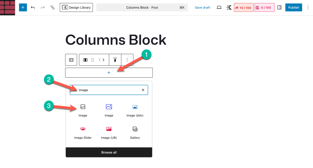
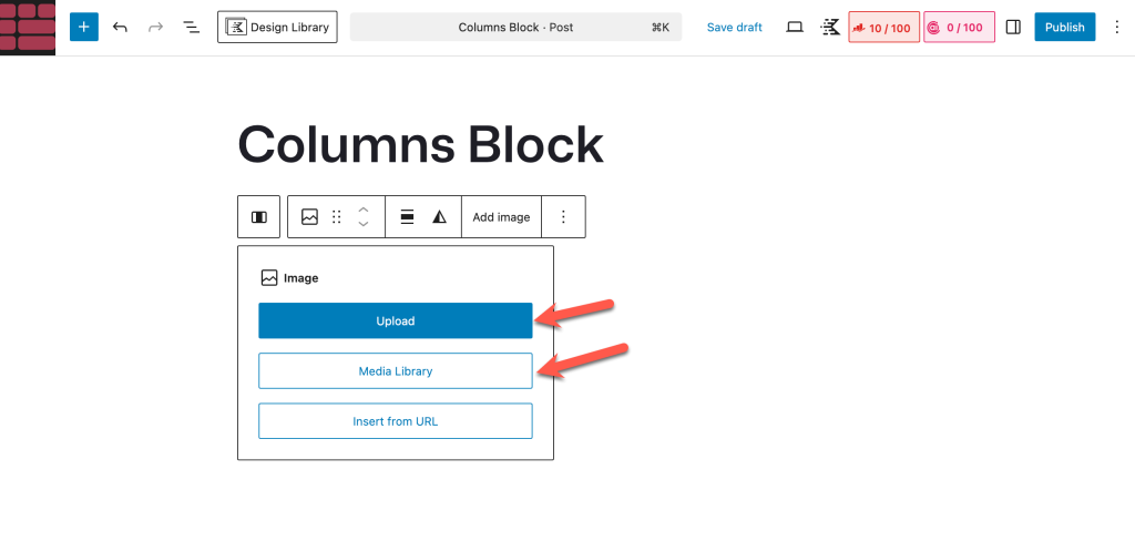
Upload a new image or select one from the Media Library.
Repeat the same process in the second column to add another image.
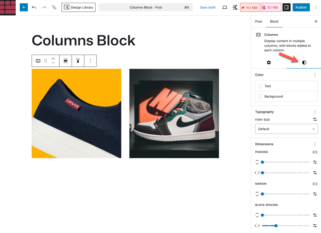
Step 3: Adjust Column and Image Settings
You can control the spacing and alignment using the block settings. Select the Columns block to adjust the column width if needed, and select each Image block to align or resize the images for a balanced look.
When to Use the Columns Block
This method is ideal if you:
- Want to show only two or three images
- Need a quick and lightweight solution
- Do not require captions, hover effects, or gallery features
However, if you want better responsiveness, captions, or more layout control, the next methods will be more suitable.
Method 2: Using the Gallery Block
WordPress comes with a default gallery block by which you can display as many posts as you want in the grid format. However, you can showcase a limited number of images side by side.
Step 01: Add the Gallery Block to the Editor
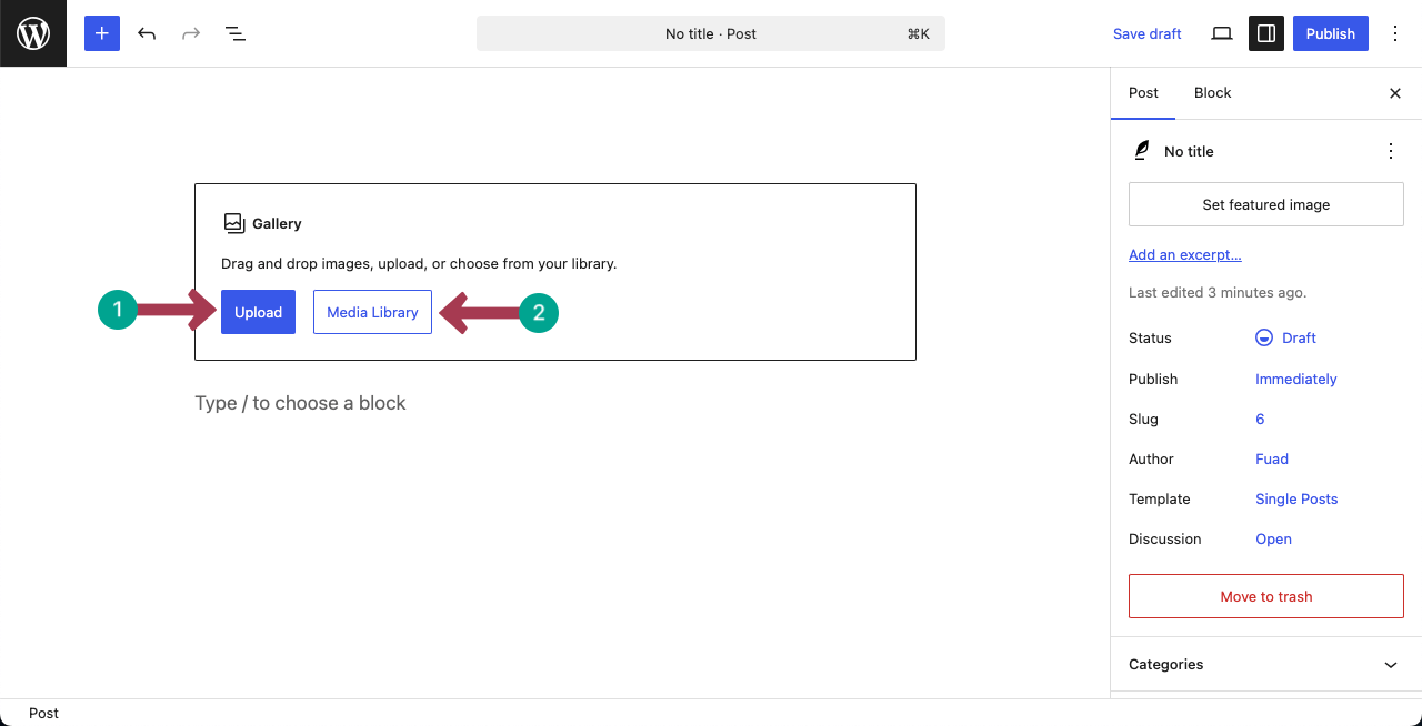
Go to a post or page. Add the Gallery block by clicking the plus (+) icon in the editor.
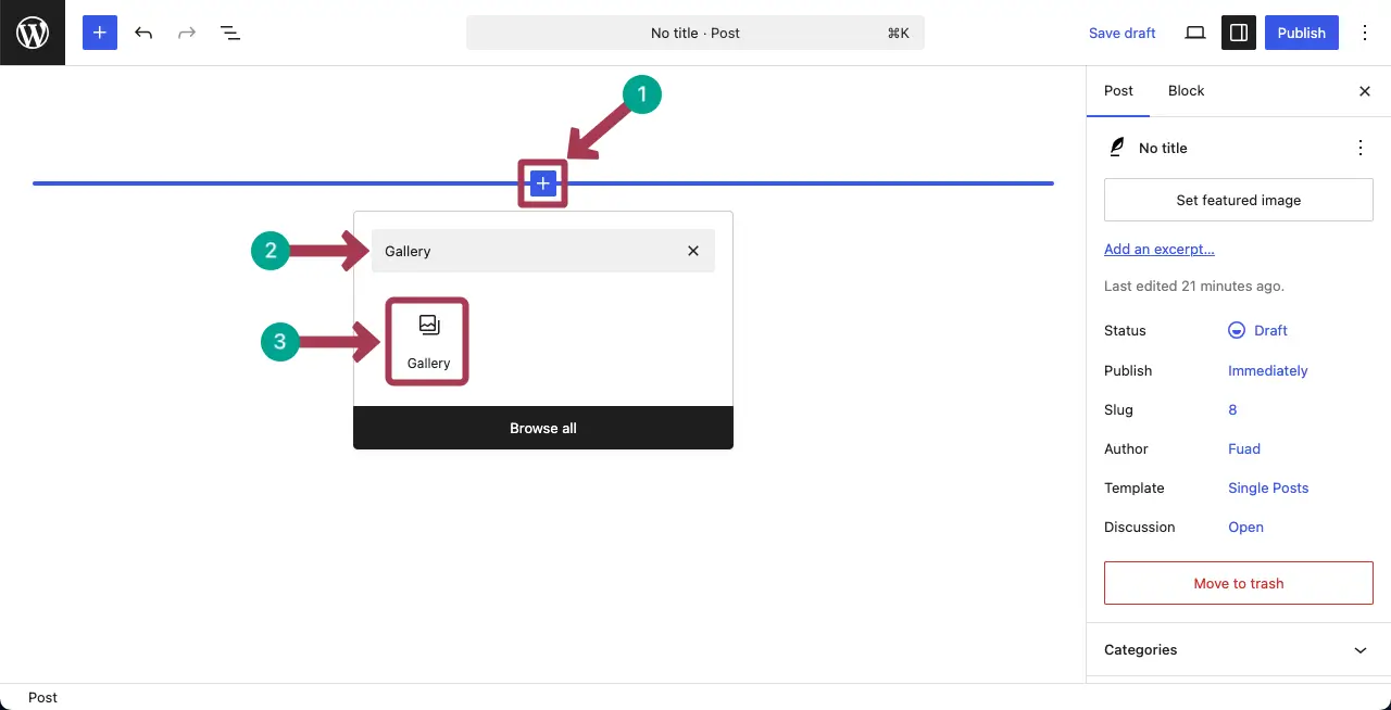
Upload images from the local drive or add them from you media library.
Step 02: Select Images
Suppose we’ll display three images side by side. So, we are selecting three images from the media library. Then, hit the Create a new gallery button.
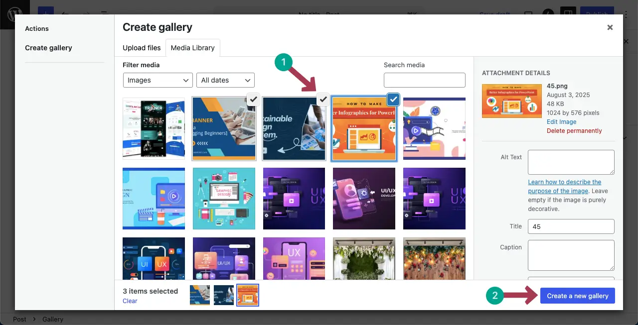
In the next step, you’ll get options to add a caption for each image you want to display side by side. Then, click the Insert Gallery button.
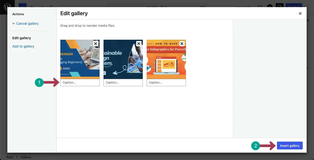
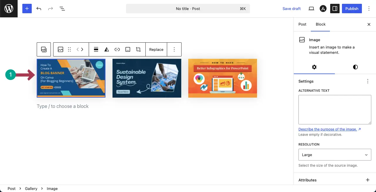
The images will be displayed side by side instantly.
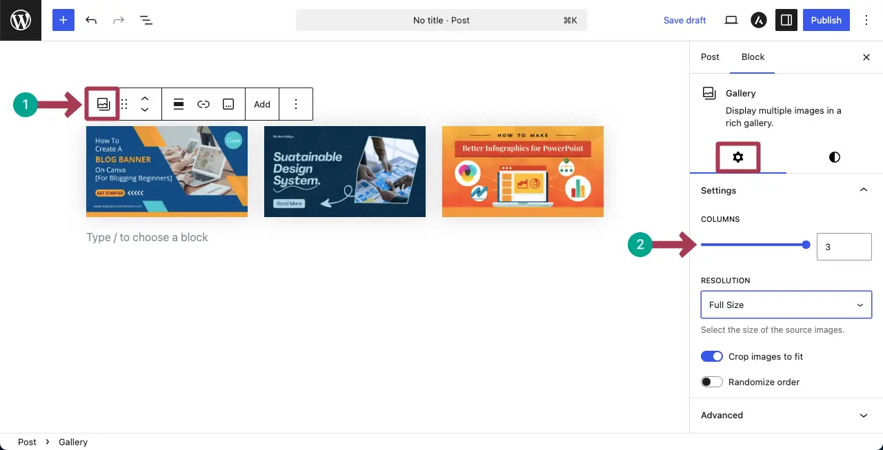
Step 03: Change the Column Number
By changing the column number, you can specify how many images you want to display side by side.
To do this, select the entire block by hitting the Gallery icon on the toolbar. Then, go to the Columns section under the Settings tab on the right sidebar.
Now, you can increase or decrease the column number.
The short video clip attached below displays how changing the column number is reflected on the gallery block.
Thus, you can display images side by side using the gallery block.
When to Use the Gallery Block
The Gallery block is a good choice when you want to display multiple images in a simple grid layout without adding extra plugins. It works well for small image collections where design flexibility is not a priority.
You should consider using the Gallery block if you:
- Want to show more than two images side by side
- Prefer a built-in WordPress solution
- Need a basic image grid with minimal setup
However, the Gallery block has limited styling and layout options. If you need more control over spacing, captions, lightbox, responsiveness, or advanced layouts, using a dedicated gallery or table-based solution may be a better fit.
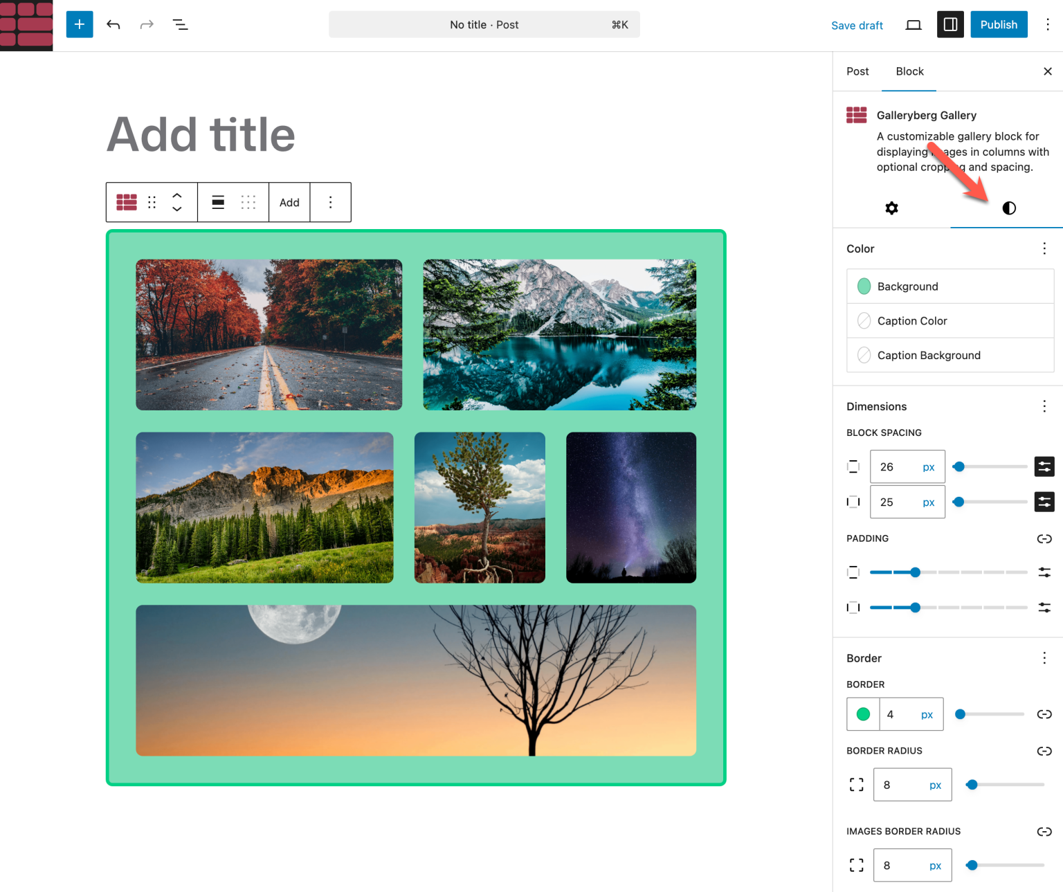
Method 3: Using Galleryberg (Best for Flexible Layouts)
If you want more control over how your images appear side by side, Galleryberg is a great option. It is a block-based WordPress gallery plugin designed specifically for creating clean, responsive image layouts without relying on page builders.
Unlike the default Gallery block, Galleryberg gives you multiple layout options, better spacing control, and advanced caption settings, making it ideal for image-heavy pages.
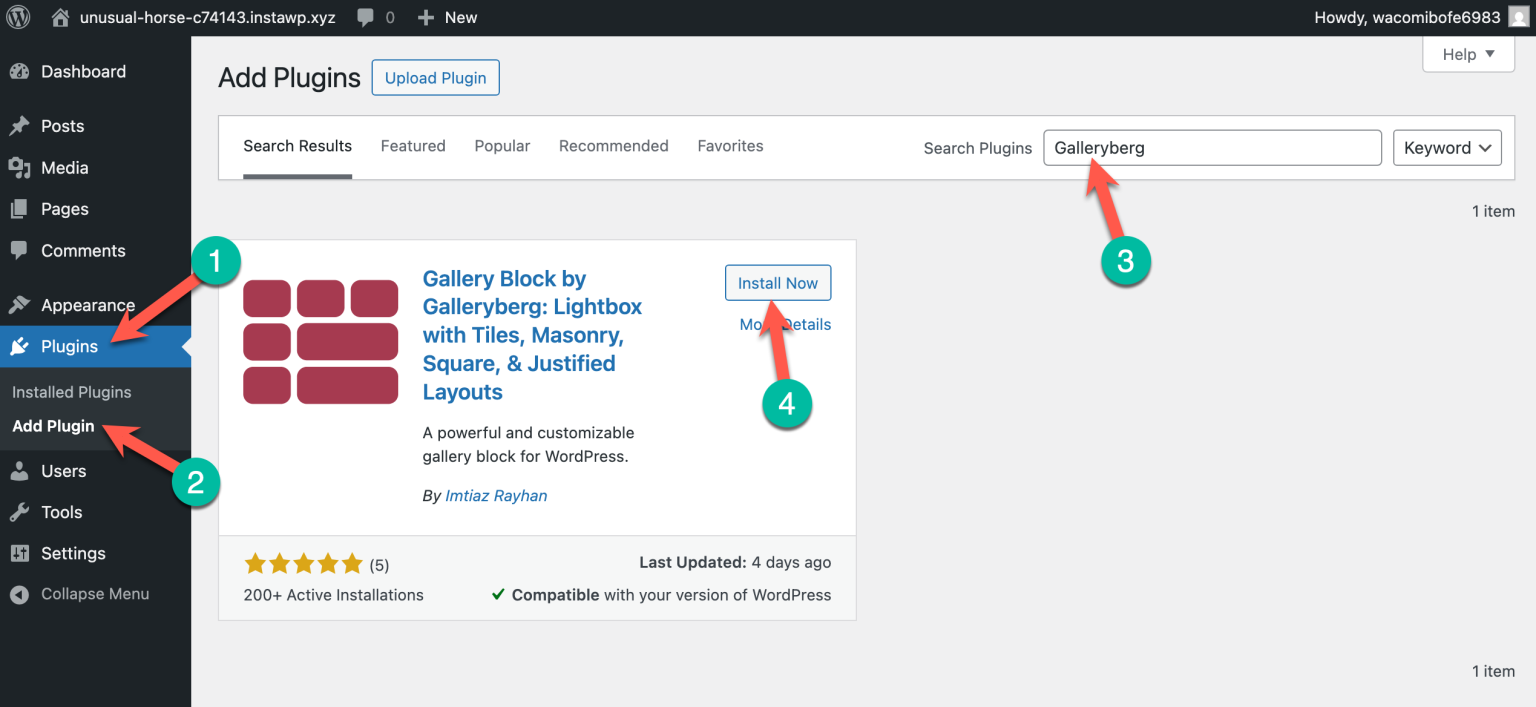
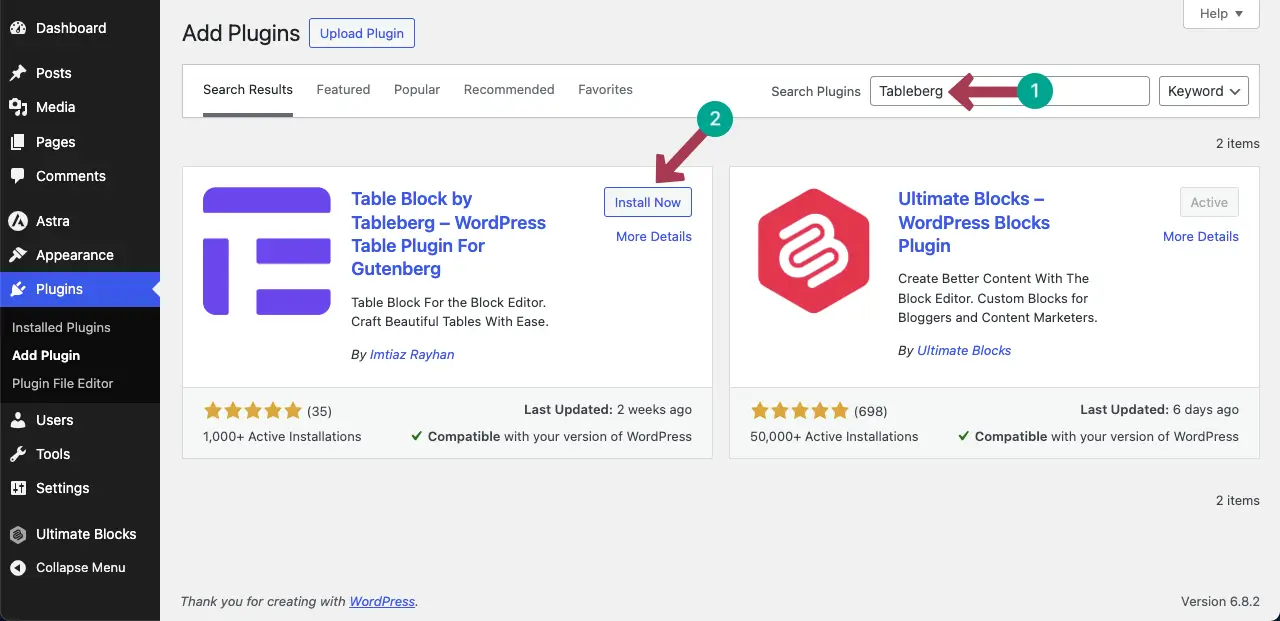
Step 1: Install and Activate Galleryberg
Go to your WordPress dashboard and navigate to Plugins → Add New. Search for Galleryberg, install the plugin, and activate it.
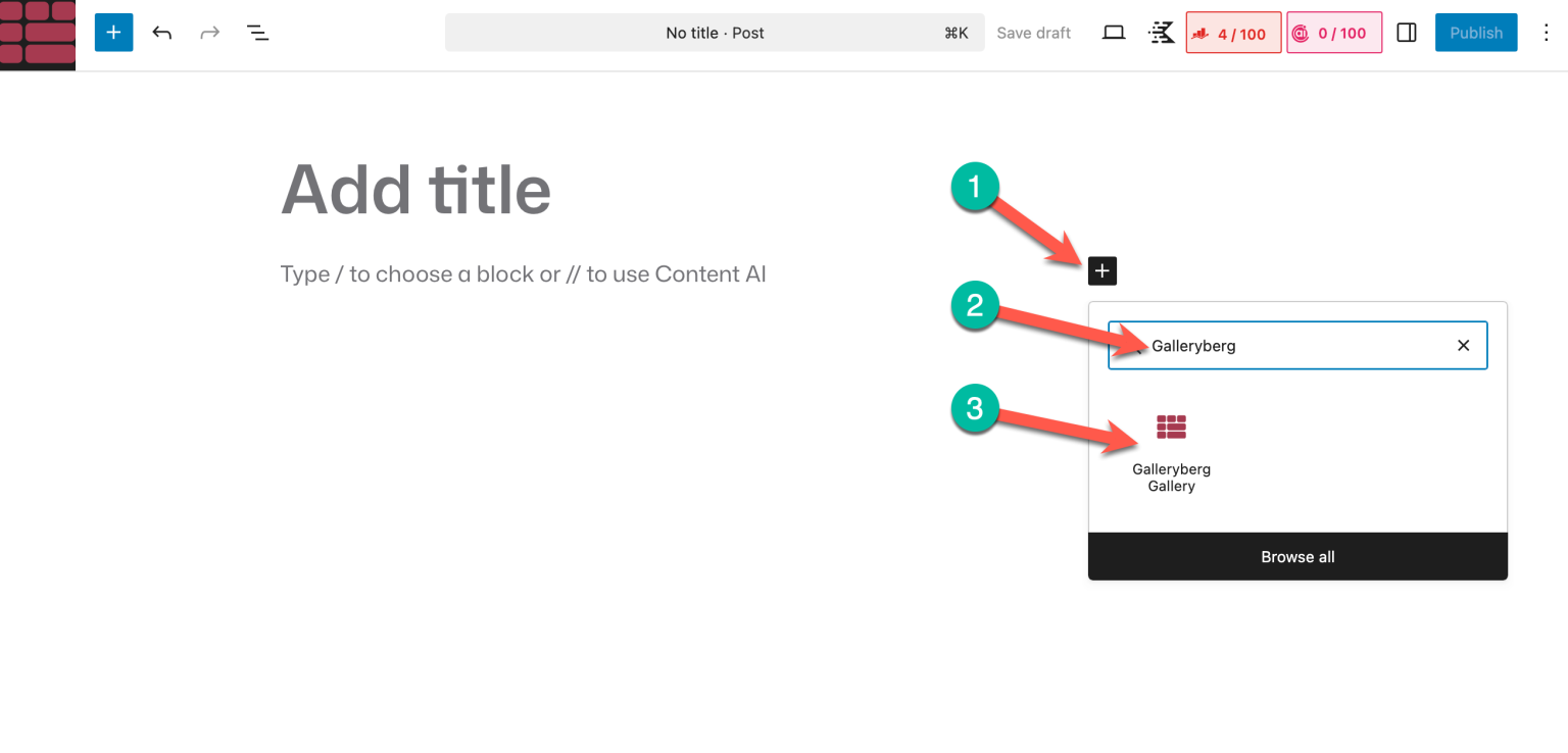
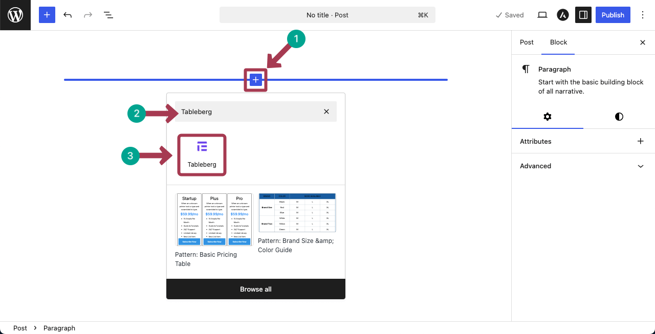
Step 2: Add the Galleryberg Block
Open the post or page where you want to display images side by side. Click the plus (+) icon in the block editor, search for Galleryberg, and insert the Galleryberg block.
Step 3: Add Images and Choose a Layout
Upload new images or select images from your Media Library.
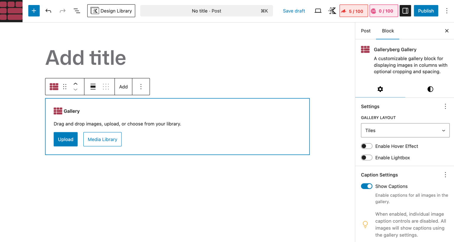
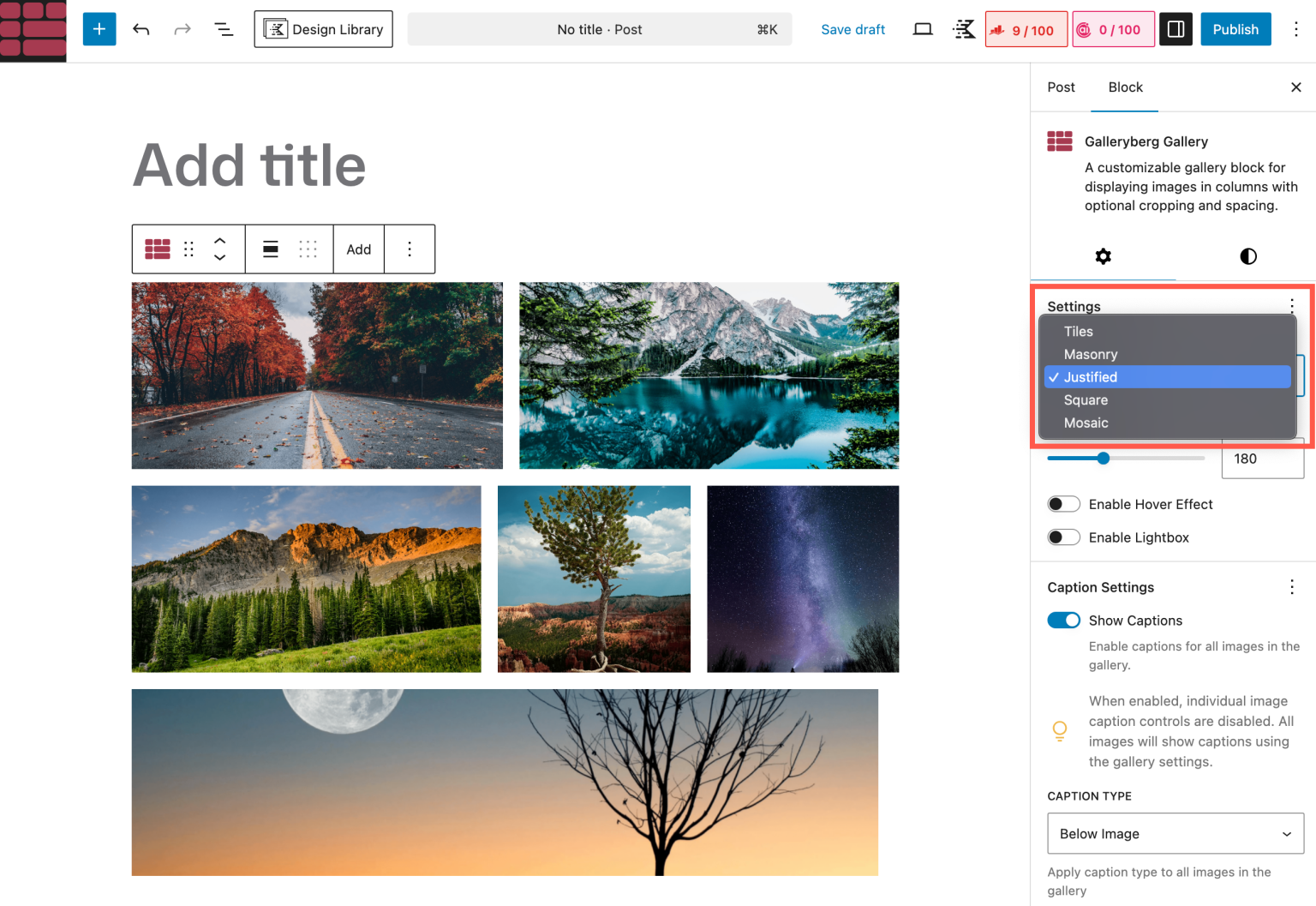
From the block settings, choose a layout such as Grid, Masonry, or Justified, depending on how you want the images to appear.
Step 4: Customize Columns and Spacing
You can control how many images appear side by side by adjusting the column settings.
Galleryberg also lets you fine-tune spacing, alignment, and image size to ensure the layout looks good on both desktop and mobile devices.
Step 5: Enhance the Gallery (Optional)
If needed, you can enable captions, hover effects, or lightbox viewing directly from the block settings, without adding extra plugins.
When to Use Galleryberg
Galleryberg is the best choice if you:
- Want flexible and responsive image layouts
- Need better spacing and alignment control
- Plan to display multiple images side by side consistently
- Prefer a block-based solution without page builder bloat
This method is especially useful for portfolios, photo collections, and content where images play an important role in the overall layout.
Method 4: Using Tableberg (Best for Structured Image Layouts)
If you want to display images side by side to create a comparison table, the gallery block or the column block isn’t enough. You need an additional plugin like Tableberg. Its free version is enough to show images side by side.
Step 01: Install and Activate the Tableberg Plugin
Like any other plugin, install and activate the Tableberg plugin from the plugin section of your WordPress dashboard.
Step 02: Add the Tableberg Block to the Editor
Come to your post or page. Add the Tableberg block to the editor. This block comes with the plugin.
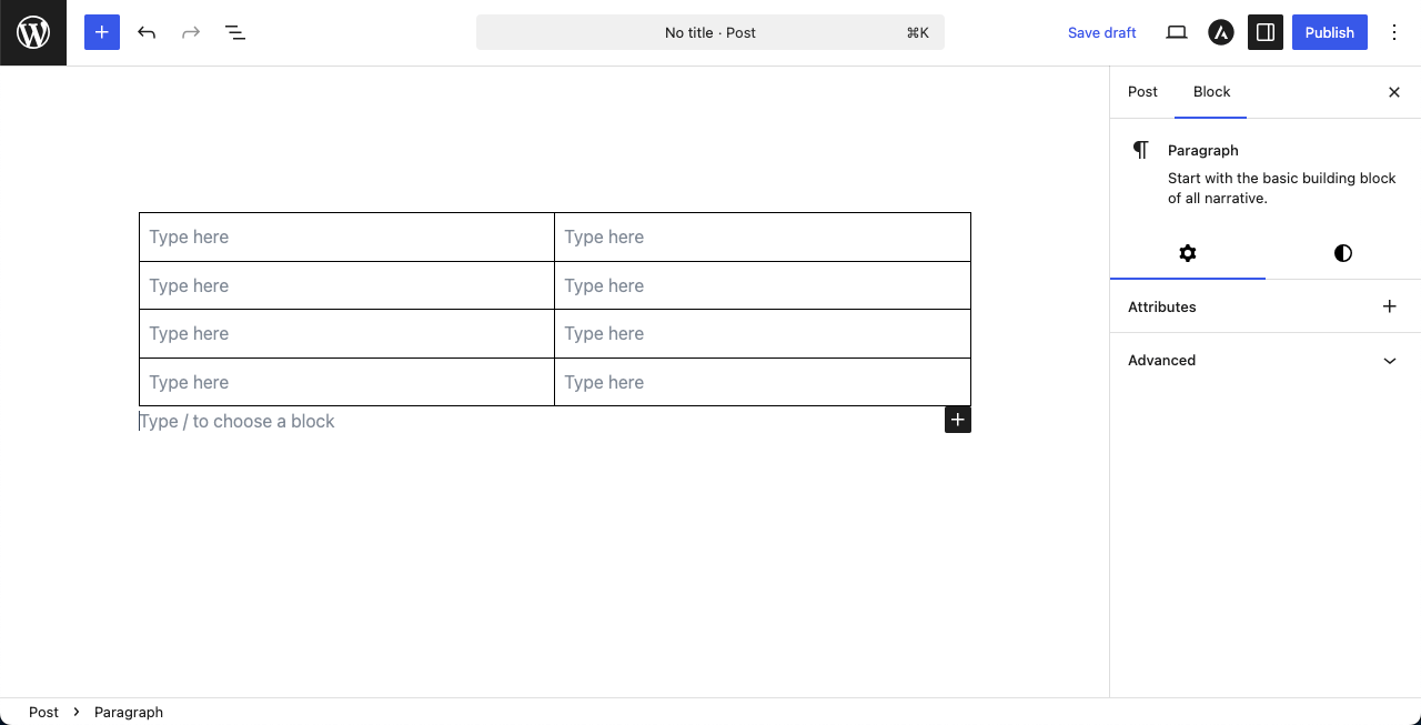
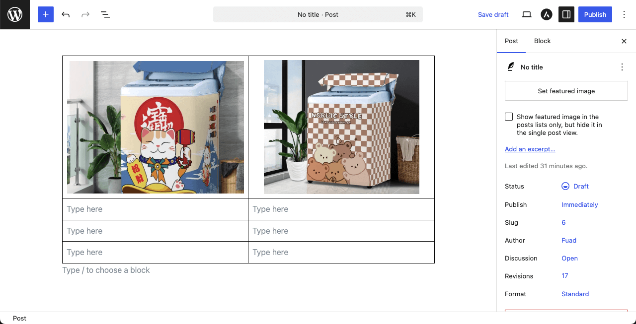
Set the number of rows and columns. For the tutorial, we are setting 2 columns and 4 rows. Hit the Create button after that.
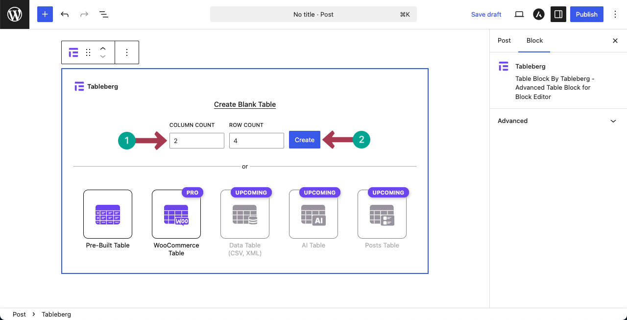
The table’s layout will be created in a few seconds.
Step 03: Add Images to the Table Cells
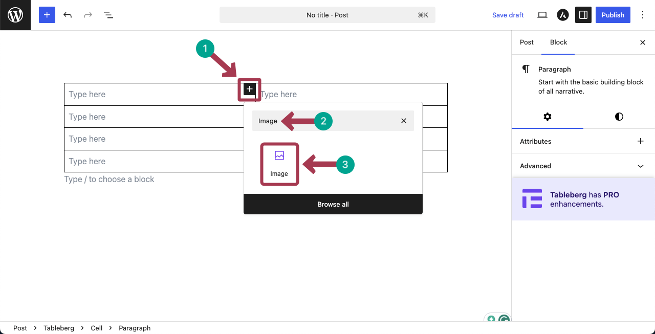
The Tableberg plugin lets you add various custom blocks to the table cells. One of them is the Image block.
The process is the same as adding any Gutenberg block to the editor. Place your cursor on a cell, hit the plus (+) icon, find the Image block, and add it.
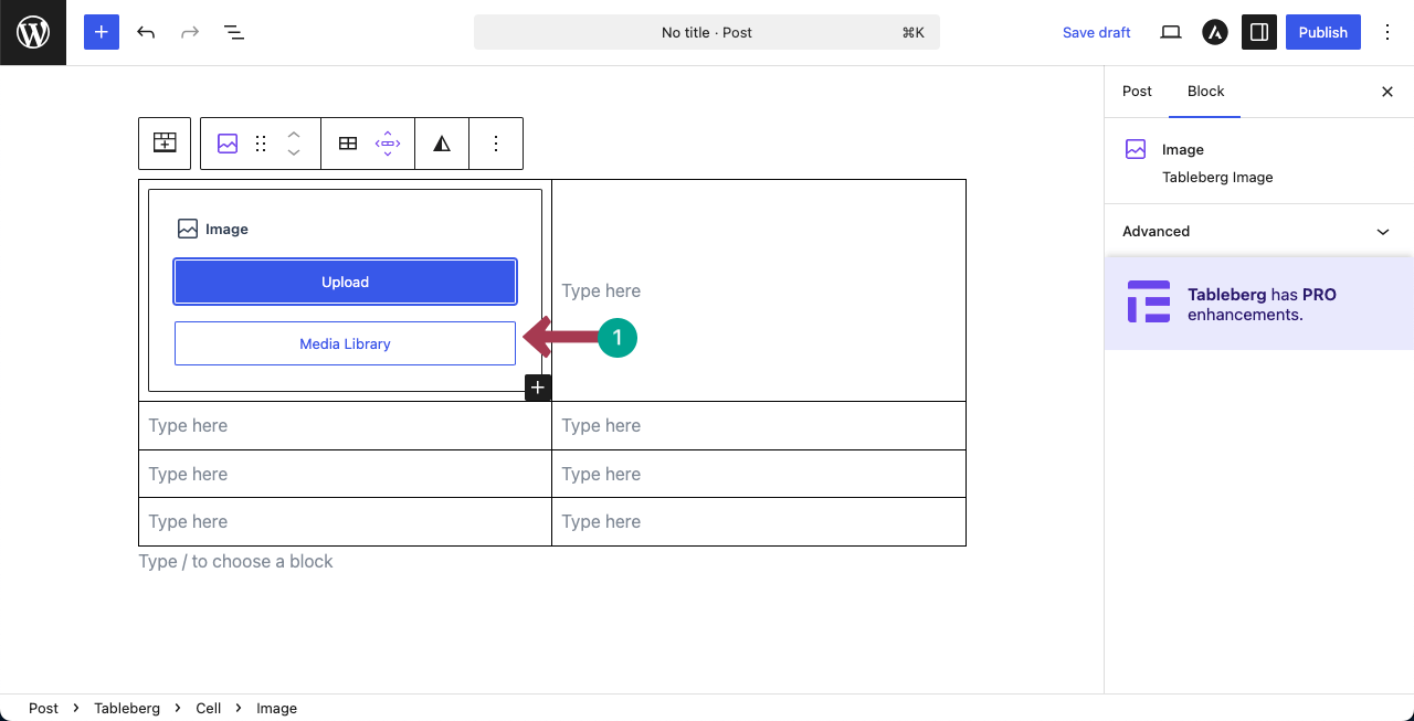
Upload an image from the local drive or add one from your media library.
You can see that we have added an image on the top-left cell on the table.
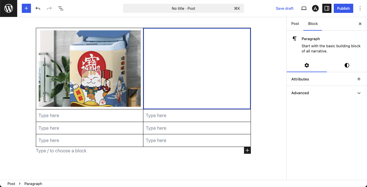
In the same way, add another image on the right side of the first image.
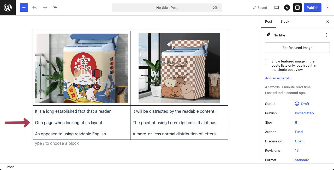
Step 04: Add Information to the Other Cells of the Table
Next, you can fill in the other cells of the table that perfectly describe the photos you have uploaded. We have just filled in the cells with some dummy texts.
We have very briefly discussed about the Tableberg plugin in this section. To know more, explore this blog pos ton how to create a comparison table in WordPress with Tableberg.
Conclusion
Placing images side by side in WordPress is not just a visual choice. It helps you compare content, highlight details, and guide your visitors’ attention more effectively. The good thing is that WordPress gives you multiple ways to achieve this, depending on your needs.
For quick layouts, the Columns or Gallery block works well. If you want more flexibility and better control over spacing and responsiveness, Galleryberg is a strong option. And when your images need to follow a clear row and column structure, Tableberg can be the right fit.
No matter which method you choose, always use images with similar dimensions to keep the layout balanced. Avoid adding too many images in a single row, especially for mobile users, and test your layout on different screen sizes to ensure it looks clean and readable everywhere.
Leave a Reply