
A responsive gallery is a group of images that automatically changes its layout based on screen size. The images resize smoothly and stay clear. Users do not need to zoom or scroll sideways, making it perfect on all device types.
Creating a responsive gallery is very important for modern websites. Most people today tend to visit websites from mobile phones. If images break or look messy, users leave the site quickly. Search engines also care about mobile-friendly design.
A responsive gallery helps your site load better and look professional on all screens. It improves user experience and keeps visitors engaged longer. In this post, we’ll show you a quick tutorial on how to create responsive galleries in WordPress.
📝 Note on WordPress Gallery Responsiveness
The default WordPress Gallery block is responsive by default. Any gallery created with it will automatically adapt to desktop, tablet, and mobile screens—no extra settings required.
However, the default Gallery block does not offer control over column counts for different devices. You can’t choose how many images appear on desktop, tablet, or mobile.
Galleryberg works as an advanced version of the default Gallery block.
It keeps the same responsive behavior, but adds the ability to:
- Convert an existing default gallery into a Galleryberg block
- Set different column numbers for desktop, tablet, and mobile
If no column settings are changed, Galleryberg behaves exactly like the default Gallery block—fully responsive by nature.
How Responsive Galleries Improve User Experience in WordPress
No doubt that over 50% of web traffic today comes from mobile devices. So, unless your galleries are perfectly optimized for small screen sizes, you’ll surely miss out on a large number of visitors. Check how such galleries can improve user experience.
1. Better Image Focus on Every Screen
Responsive galleries resize images properly for each device. This keeps the main subject clear without cutting important parts of the photo.
2. Smoother Touch Navigation on Mobile
Mobile users usually rely on swipes and taps. Responsive galleries support smooth navigation, which makes browsing images feel natural and easy.
3. Faster Loading on Different Devices
Responsive galleries load the right image size for each screen. This reduces data usage and speeds up page loading, especially on mobile networks.
4. Consistent Layout Across Browsers
Images stay aligned and balanced on all browsers. This prevents broken layouts that can confuse or frustrate visitors.
5. Longer Time Spent on Visual Content
When images are easy to view, users tend to explore more photos. This surely can increase engagement and keep visitors on your site longer.
How to Create a Responsive Gallery in WordPress
To create a responsive gallery with full control, you need a dedicated plugin. The default WordPress gallery is very basic. It does not give you enough options to manage layout, spacing, or responsiveness properly.
Galleryberg is a feature-rich and promising plugin that allows you to create comprehensive galleries in the WordPress editor. It gives you advanced responsive control. Get the plugin by clicking the buttons attached below.
Once the plugin is installed, you’ll get a Galleryberg dashboard on the backendof your website. Now, you are all set to create a responsive image gallery.
Start following the steps as explained below. Check how Galleryberg makes your WordPress gallery more interactive.
Step 01: Creating a Gallery with the Plugin
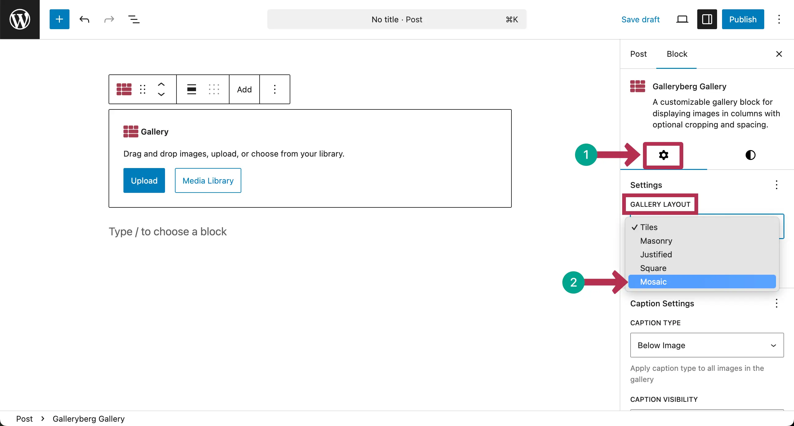
Open a post/page. Find and add the Galleryberg block to the editor.

From the settings tab on the right sidebar, choose the type of Gallery you want to create.
The plugin allows you to create five types of gallery: Tiles, Masonry, Justified, Square, and Mosaic. For this tutorial, we’re selecting the Tiles type.
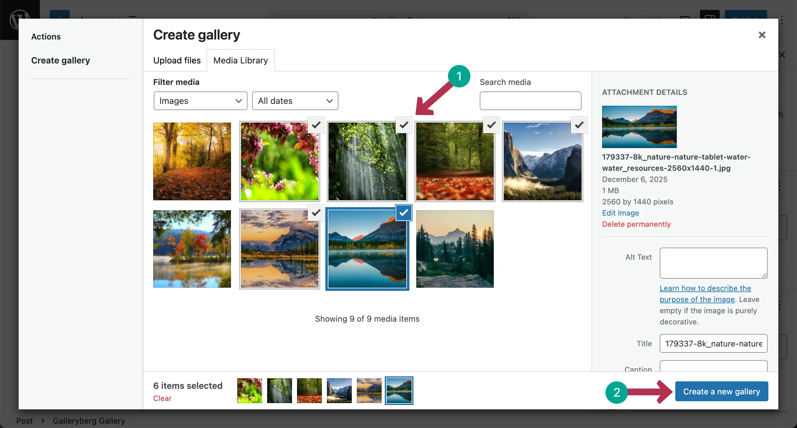
Now, it’s time to add images to the gallery. You can upload it from the local drive or choose from your media library.

After images are uploaded, select the ones you really want to display in your gallery. Then, hit the Create a new gallery button.
In the next step, you can add captions to the images one by one. Click the Insert gallery button.

The gallery will be created right away.

Take a look at the best Gutenberg slider block plugins.
Step 02: Configure Mobile Responsive Settings
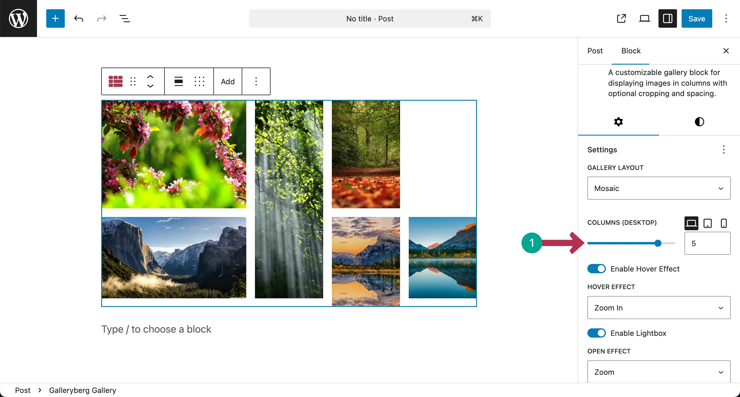
Once you select the entire gallery block, under the settings tab, you’ll see the columns section. From here, you can set the number of columns you want to display based on the device type for mobile responsiveness.
By default, the Desktop mode is always selected.
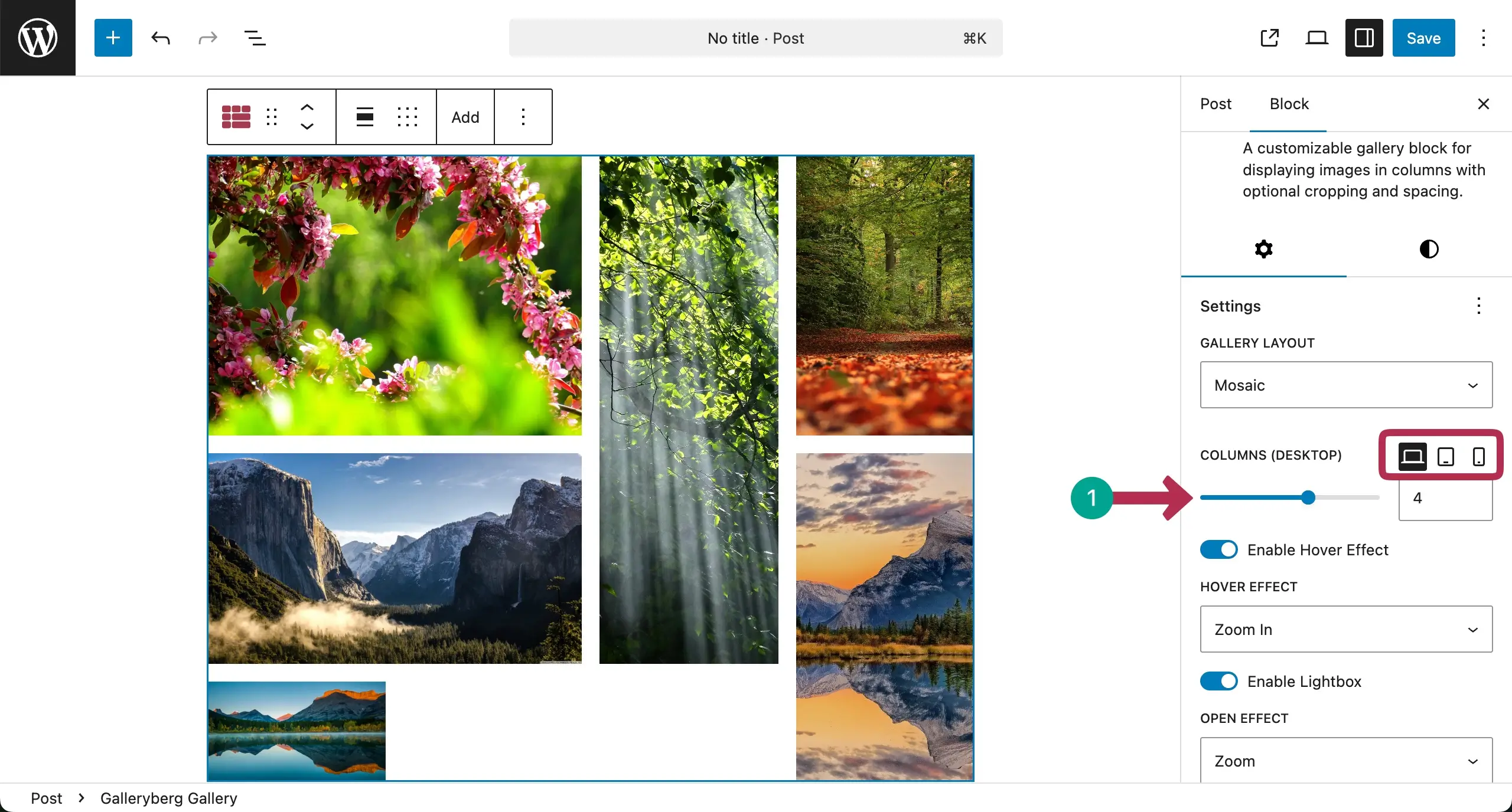
Select the number of column you want for the Desktop mode. For this tutorial, we’re selecting it five.
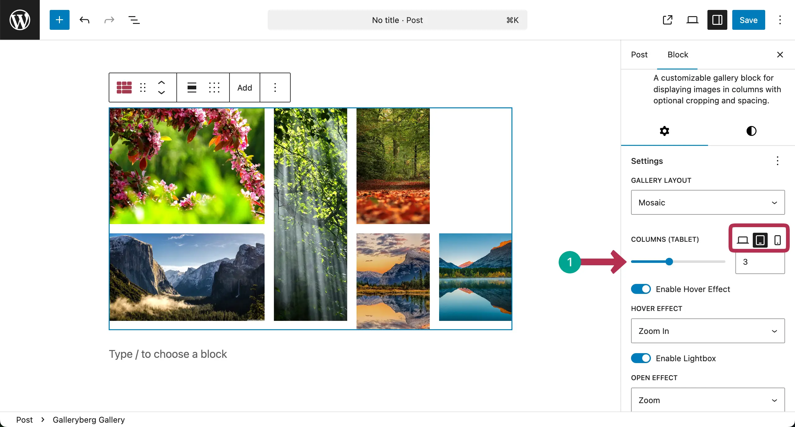
# For Tablet
Now, switch to the Tablet mode and select the number of columns you want for this device type.
# For Mobile
In the same way, switch to the mobile mode and select the number of columns you want for this device type.
Note: Don’t worry if your changes aren’t instantly shown up in the editor. Once you finish the settings and check the preview, you will see that the responsive settings are working properly.

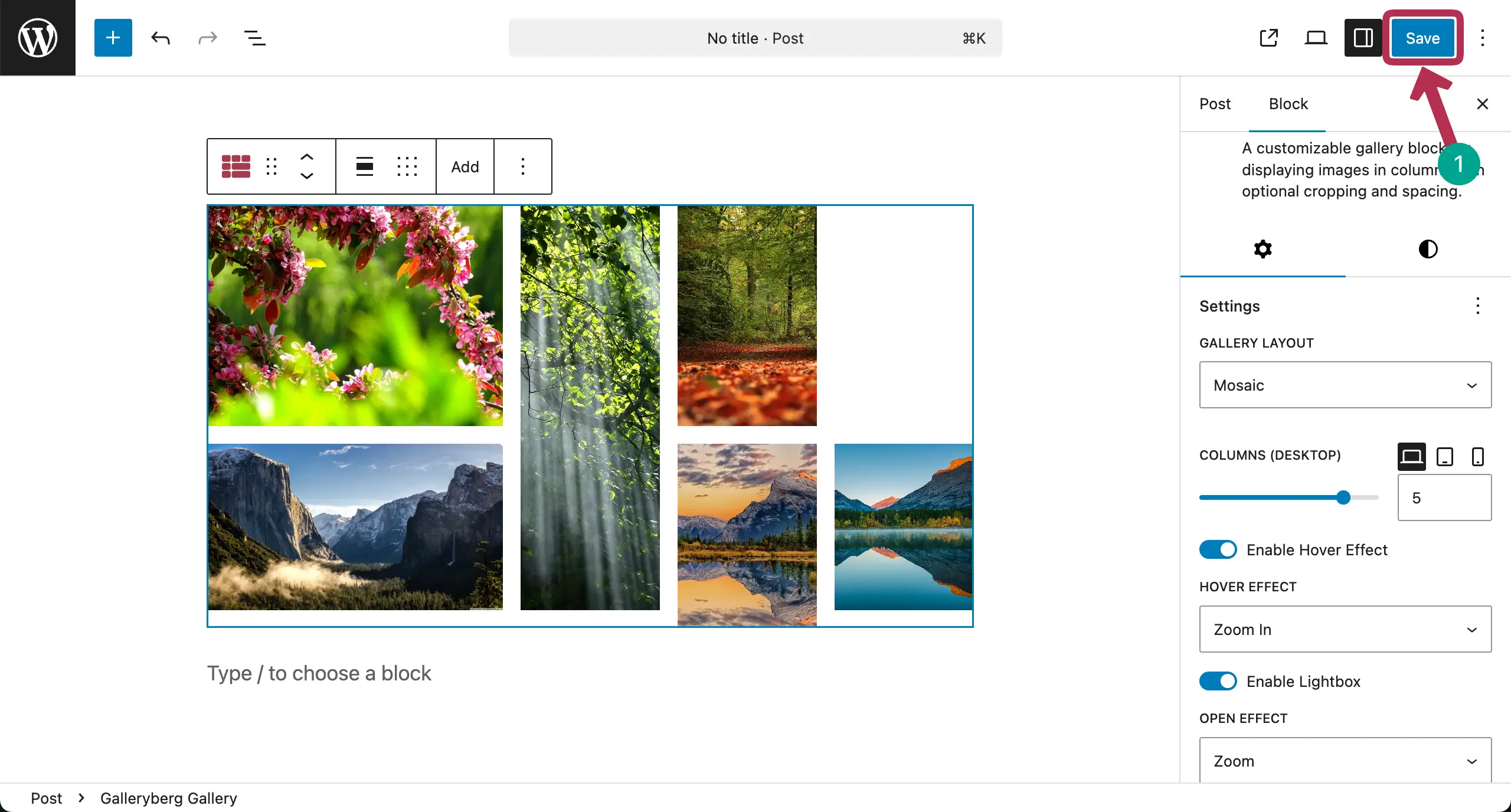
When all settings are done, save the gallery.
Now, go to the preview mode and check if its responsiveness works well on different device modes or not. You can see that it’s workin well on our end.
Thus, you can make your image galleries mobile responsive. Explore the best Gutenberg gallery block plugins.
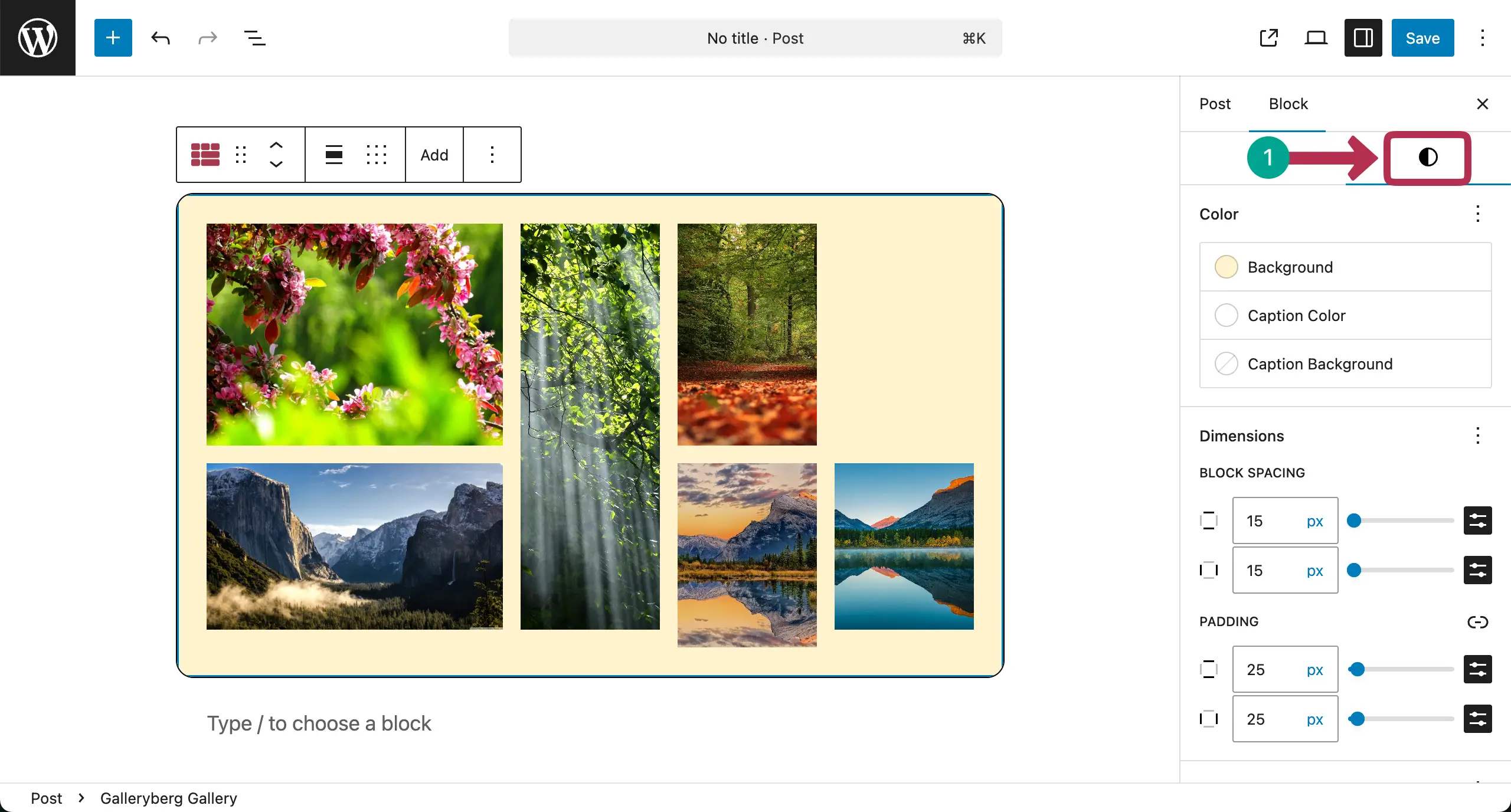
Step 03: Stylize the Image Gallery
When the responsive part is done, you can stylize the gallery so it looks good. Below you can see that we have added padding, margin, and background color to the gallery.
We are not explaining it in this post as we have already covered detailed documentation on how to stylize each part of the gallery. We hope that you can learn it well from the documentation posts.
Conclusion
Creating a responsive gallery in WordPress is not difficult if you follow the right steps. A good gallery should look clean and work well on all screen sizes. Always test your gallery on desktop, tablet, and mobile devices.
This can help you find layout issues early and fix them before visitors notice. Besides, optimize your images before uploading them to reduce file size. Smaller images load faster and improve site performance.
Also, keep the gallery simple. Too many effects can slow down your site and distract users. Now, if there is any question in your mind regarding the plugin, mention it in the comment box below. We’ll reply to you soon.
Leave a Reply